Sophie Kate Photography
A review of Sophie Kate Photography
Designing with Figma
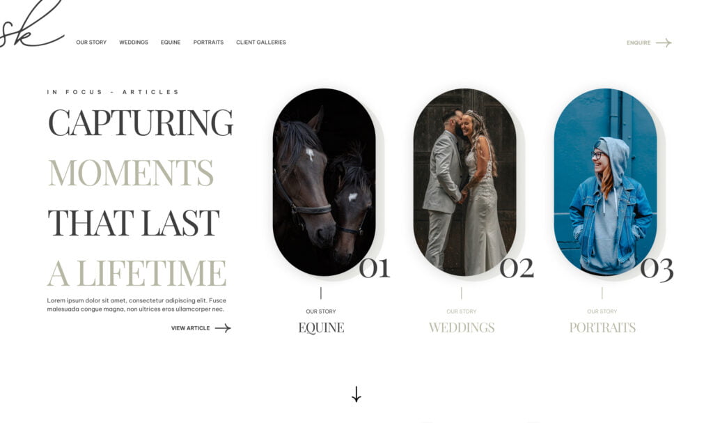
With a clear vision in mind, Sophie turned to Figma to bring her website to life. She carefully thought about every detail, from the layout to the colour scheme, ensuring a seamless user experience.

Putting the User First: Prioritising UI and UX
Sophie knew that user experience was key. She wanted her website to be not only visually stunning but also easy to navigate. So, she spent hours tweaking the UI and UX to perfection, making sure every click was a delight.
Designing the Logo
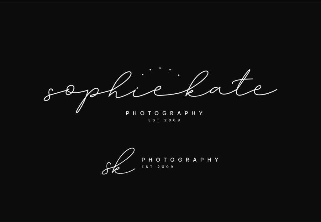
No website is complete without a killer logo. Sophie worked with a designer to craft a logo that reflected her style and personality. After a few rounds of revisions, they landed on the perfect design – simple, elegant, and instantly recognisable.

Discussing Photography Hosting
As a photographer, showcasing her work was a top priority for Sophie. She carefully considered her options and settled on a hosting provider that could handle high-resolution images without compromising on speed or quality.
Bringing it All Together: Launching the Website
After months of hard work and dedication, Sophie’s website was finally ready to go live. With a click of a button, she unveiled her masterpiece to the world – a stunning showcase of her talent and passion for photography.

The Results
Sophie’s website quickly became a hit among couples planning their weddings. Its sleek design, user-friendly interface, and breathtaking photography drew in visitors from far and wide. Within months, Sophie had bookings pouring in, and her business was thriving like never before.
The Power of a Well-Designed Website
Sophie Kate Photography’s journey from concept to launch is a testament to the importance of thoughtful website development. By carefully planning, designing, and executing her vision, Sophie was able to create a digital presence that not only showcased her work but also propelled her business to new heights.